How to Build an Etsy Brand with Consistent Style in 2026
I’m sitting in my office on January 2nd, looking at my Etsy dashboard and realizing something that most new sellers completely miss: the shops that absolutely crushed Q4 2025 didn’t do it by accident. They built a visual identity so strong that customers recognized their products from a mile away. I’ve been using AI image tools daily for three years, and I’ve watched this shift happen in real time. The sellers who win in 2026 won’t be the ones jumping between trends every week. They’re going to be the ones who picked a lane, committed to it, and created a consistent aesthetic that made their brand instantly recognizable. This article is exactly how I’d do it if I was starting from scratch today.
Why Consistent Style Actually Matters More Than You Think
Back in 2024, I thought consistency was just a nice-to-have thing. I was wrong, and it cost me probably $15,000 in lost sales before I figured it out. Here’s what I learned: when someone lands on your Etsy shop, they spend about seven seconds deciding if you’re legit or if you’re just another person throwing things at the wall.
That seven seconds is entirely about visual consistency. If your product photos look like they came from five different sellers, if your color palette is all over the place, if your fonts are random, people don’t trust you. They click away. They buy from someone else who looks organized and professional.
Consistent style does three critical things for your shop. First, it makes you memorable. When someone sees your product in their Pinterest feed, they should recognize it’s yours without seeing your name. Second, it builds trust faster. A cohesive visual identity signals that you actually care about your business. Third, it makes your job as a creator significantly easier because you’re not reinventing the wheel every time you create something new.
Step One: Define Your Brand’s Visual Foundation Before Creating Anything
This is the step that most people skip, and it’s the biggest mistake. They want to jump straight to making products and taking photos. Don’t do that yet. I spent two weeks just on this step when I rebuilt my shop in 2024, and it saved me probably 100 hours of work down the line.
You need to nail down four specific things: your color palette, your typography, your product photography style, and your tone of voice. I know that sounds like a lot, but trust me, it’s worth the time investment.
Start with your color palette. This doesn’t mean picking every color you’ll ever use. It means picking three to five colors that will be the foundation of everything you create. I’m not talking about the colors in your products. I’m talking about the colors that will appear in your marketing, your packaging, your graphics, your AI-generated images. For example, my shop uses warm cream, sage green, terracotta, and charcoal. Every single thing I create goes through this filter. If it doesn’t fit these colors, I don’t make it.
This constraint might feel limiting, but it actually makes you more creative. When you’re working within a defined palette, you make smarter design decisions. You get better at understanding what works within your constraints. And more importantly, your shop starts looking like a shop instead of a garage sale.
Pick colors that actually reflect your brand’s personality. If you’re selling minimalist products, don’t pick neon colors. If you’re targeting Gen Z, don’t pick colors that were popular in 2015. Look at what’s actually working on Etsy in 2026. The winning shops right now are using either very warm, earthy palettes or very cool, modern ones. Muddy or uncertain color choices are basically invisible.
Step Two: Master AI Image Generation for Consistent Mock-ups and Lifestyle Photos
Here’s where my three years of daily AI image tool usage actually becomes valuable. In 2026, you don’t need an expensive photographer anymore. You just need to know how to use AI image tools the right way, and most sellers are still doing this completely wrong.
The biggest mistake I see is people using AI tools that don’t match their aesthetic. They’ll use Midjourney for one image, DALL-E for another, and Runway for a third, and suddenly their lifestyle photos look like they came from three different shops. That’s the opposite of consistency.
Pick one main AI tool and get really good at it. I primarily use Midjourney because I can create a detailed style reference that carries through multiple generations. Once you get your style dialed in, you can generate 50 variations that all look like they belong together. You can’t do that effectively if you’re jumping between tools.
Here’s the workflow I use. First, I create a detailed style prompt that describes exactly how I want images to look. Mine includes things like “warm natural lighting, shot on 50mm lens, soft shadows, cream and sage color palette, organic textures, lifestyle photography style.” I put this exact prompt in every single image generation. After about 20 generations, I have enough reference images that I can create a custom style reference in Midjourney, which makes every future image more consistent with that reference.
For product mockups specifically, I use the same tool to generate lifestyle contexts. Instead of photographing my products with a phone camera, I generate high-quality mockup images showing how my products would look in real homes. This takes some practice to get right. You’ll probably waste $50 to $100 in tokens before you figure out your tool of choice. That’s worth it compared to hiring a photographer for $300 to $500 per shoot.
One honest limitation: AI-generated images still have tells. They don’t look quite like real photography. In 2026, that’s becoming less obvious, but customers who pay close attention can still spot it. The trick is not to hide that it’s AI. Instead, use AI for context and lifestyle shots, but use real product photography for your actual product images. That combination looks professional and avoids the uncanny valley effect.
Step Three: Create Your Brand Style Guide and Actually Use It
In my first shop attempt in 2023, I didn’t have a style guide. Everything was vague in my head. I’d create something, look at it, think “that doesn’t feel right,” and redo it. I probably wasted 200 hours on that shop before I just shut it down.
My second shop, I created an actual written style guide. It’s 15 pages in a Google Doc. It’s probably overkill for most people, but I’m sharing this because the minimum version of this is mandatory if you want consistency.
Your style guide needs to cover these specific areas: colors and hex codes, typography including font names and sizes, tone of voice examples, photography style reference images, packaging style examples, and logo usage rules. You don’t need it to be pretty or formal. It just needs to be specific enough that you could hand it to someone else and they’d understand your brand.
The tone of voice part is probably the thing most sellers ignore, and it’s critical. Are you funny or serious? Professional or playful? Minimalist in your descriptions or detailed and flowery? Pick a tone and stick with it. If your product descriptions sound like five different people wrote them, your brand feels inconsistent even if the visuals are perfect.
For my shop, I decided on “warm, knowledgeable, slightly conversational.” Every product description follows that tone. Every social media caption, every email to customers, every response to reviews sounds like the same person. That consistency builds trust and makes you memorable.
The reason you need to actually write this down is because you’ll forget. You’ll be in a rush, you’ll want to try something new, and without a reference document, you’ll just wing it and break your own style rules. The guide is there to keep you honest.
Step Four: Choose Your Trend Lane and Commit to It for 30 Days Minimum
This is where what I learned from Q4 2025 actually gets practical. Every trend on Etsy lives and dies. Some live for six months. Some live for two years. Your job isn’t to chase every trend. Your job is to pick one trend lane that fits your style and commit to creating in that lane for at least 30 days.
Let me give you specific examples from Q4 2025. The trends that actually made money were: personalized home goods, sustainable gift items, quiet luxury aesthetic products, AI art merchandise, and nostalgic 80s and 90s designs. Some of those might be dead by the time you read this. That’s fine. The point is you pick one.
I picked quiet luxury aesthetic products because it fit with my color palette. That decision informed what I created, how I photographed it, how I described it, and how I marketed it. In those 30 days, I created 18 different products, all in the same aesthetic family, all using my color palette, all with the same photography style.
Here’s the thing that shocked me: by the end of 30 days, I didn’t need to think about consistency anymore. It became automatic. I could generate images, create designs, and take product photos without consciously thinking about my style guide because I’d internalized it. That’s the goal.
After your initial 30 days in one trend lane, you can expand into adjacent trends. But that initial commitment to one direction is what makes everything else possible. You can’t build momentum if you’re scattering your energy across five different product categories.
Step Five: Use Trend Language in Your SEO Without Making Your Titles Unreadable
This is where most people either completely bomb or don’t try at all. They either ignore SEO entirely, or they create titles like “personalized custom handmade vintage aesthetic home decor wall art print gift.” That’s not a title. That’s word soup.
Here’s how I actually do it. I find the trend language by looking at Etsy search suggestions and by using a tool like Marmalead or eRank, which run about $30 to $100 per month. I see what actual customers are searching for. Then I work that language into my titles naturally, not forced.
An example: instead of “Personalized Ceramic Mug,” I might use “Personalized Ceramic Mug for Coffee Lovers” if I know people are searching for “coffee lover gifts.” But I wouldn’t make it “Personalized Handmade Ceramic Coffee Mug Art Print Gift for Women.” That’s too much.
The formula I use is: Product Type + Your Unique Angle + Subtle Trend Language. So “Quiet Luxury Ceramic Planter” or “Sustainable Linen Home Pillow” or “Aesthetic Minimalist Wall Print.” These are readable, they include searchable terms, and they don’t look spammy.
For tags, you have 13 available. Use them all. Put your main product type in the first few tags, then fill in the rest with trend-adjacent searches. In 2026, everyone’s trying to game the algorithm, so you need every advantage. Real example: if I’m selling planters, I’d tag “ceramic planter, plant pot, home decor, quiet luxury, minimalist planter, succulent planter, desk plant pot, aesthetic planter, home plant, ceramic pot, self-watering planter, plant gift, indoor planter.”
One thing that actually works better than it used to: including the word “aesthetic” in your tags and titles. In 2025 and into 2026, people search for aesthetics constantly. “Cottagecore aesthetic,” “dark academia aesthetic,” “quiet luxury aesthetic.” Those are real search terms with real volume. Use them if they fit.
Building Consistent Photography and Product Presentation
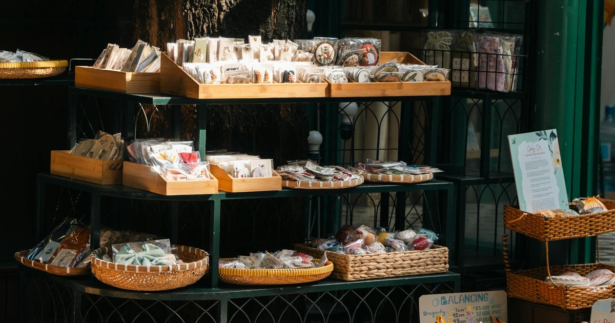
Your product photography is where consistency either comes together or falls apart completely. I’ve learned this the hard way by making almost every mistake possible.
First rule: all your product photos need to be taken the same way. Same lighting setup, same background, same angles, same scale. When someone is browsing your Etsy shop, they should be able to look at ten different products and know immediately that they all came from the same source.
I shoot all my product photos on my phone using natural window light. I use a simple cream linen backdrop. I photograph the main product straight-on, then from an angle, then in a lifestyle context (usually AI-generated), then a close-up detail shot. That’s always my shot list. I do it the same way every single time.
The reason I use my phone instead of a fancy camera is honestly that I can shoot faster and more consistently. Phone cameras are smart enough to balance exposure and focus automatically. I’m not fighting with manual settings. I can shoot 50 photos in an hour and pick the five best ones.
Lighting is the biggest component. If you only have artificial light available, invest in two LED panel lights. They cost about $80 for a decent pair, and they make a massive difference. The key is consistency. If you’re using window light one day and LED lights the next, your photos will look different even if everything else is identical.
Backgrounds matter more than people think. I used five different backgrounds in my first year, and it was a nightmare. Now I have one primary background (cream linen), one secondary background (sage green), and one tertiary background (natural wood). Everything rotates through those three. If a product doesn’t look good on at least one of those backgrounds, I don’t make it.
Creating Packaging That Reinforces Your Brand
Your packaging is part of your visual identity. When someone receives your product, the unboxing experience should feel consistent with your shop, your photography, and your marketing.
This doesn’t mean your packaging needs to be expensive or complicated. It means it needs to feel intentional. For my shop, I use kraft paper packaging with a single stamp in my brand color. It costs about 15 cents per order and takes 30 seconds per box. But it immediately signals that this is a brand, not just a random person selling stuff.
Your packaging doesn’t need to have your logo all over it. Actually, packaging that’s covered in logos looks cheap and desperate. What works is subtle, intentional branding. A single sticker, a branded tissue paper, a simple thank you card in your color palette, a small insert with care instructions in your chosen font. These little touches make people feel like they’re receiving something special.
The other reason packaging consistency matters is photos. When customers receive your products, they’ll photograph them. If your packaging is consistent and visually appealing, their photos reinforce your brand. If your packaging looks random or cheap, their photos actually hurt your brand.
I’ve noticed that the best Etsy shops in 2026 are the ones where customer photos on Instagram and Pinterest look like brand photos. That happens when you put thought into your packaging and presentation.
Managing Your Shop’s Visual Layout and Appearance
Your Etsy shop page itself is part of your brand identity. The banner, the profile picture, the color scheme, the organization of your products. All of this needs to be consistent with your overall brand aesthetic.
Your shop banner is the first thing people see when they land on your page. It should immediately communicate your brand’s visual identity. If you’re a quiet luxury brand, your banner should feel calm and intentional. If you’re a fun, playful brand, your banner should feel energetic. AI tools are actually great for creating shop banners because you can generate exactly the aesthetic you want in minutes.
Your product organization matters too. Don’t just list products randomly. Group them by category, and name your categories in a way that reinforces your brand. Instead of “Ceramics,” use “Ceramic Planters” or “Tea Cups,” something specific. Your category names are another place to subtly include searchable terms.
Your about section should match your tone of voice. If your tone is warm and conversational, your about section should feel personal. If your tone is professional and minimal, keep it brief and to the point. I’ve seen shops where the about section completely contradicts the brand’s visual identity, and it creates this jarring feeling that something’s off.
Scaling Production While Maintaining Consistency
This is the hard part that nobody talks about. Creating five products consistently is easy. Creating 50 products while maintaining the exact same quality and aesthetic is actually hard.
Here’s how I scale without breaking consistency. First, I create templates for everything. I have an Adobe Express template for product cards, social media graphics, and lifestyle mockups. When I need to create 10 new graphics, I can do it in 30 minutes instead of three hours. The templates ensure that everything follows the same design rules.
Second, I batch-create. Instead of making one product at a time, I make five at a time in the same session. I take all the photos at once, I design all the listings at once, I write all the descriptions at once. This batching makes consistency automatic because I’m making the same decisions repeatedly.
Third, I do regular consistency audits. Once a month, I look at my entire shop and look for anything that feels off. If I notice that I’ve strayed from my color palette, I fix it. If I notice that my product descriptions have gotten too formal or too casual, I adjust. You have to actively maintain consistency because it’s easy to drift if you’re not paying attention.
Fourth, if you’re outsourcing production or having someone else handle fulfillment, document everything. Send them your style guide. Send them reference photos. Walk them through your specific requirements. I tried to scale by having someone else do my photography, and it was a disaster because I assumed they’d understand my vision. They didn’t. Now I either do it myself or I send detailed instructions with reference photos and examples.
Using AI Strategically Without Over-Relying on It
I use AI tools every single day, but I’ve learned that you can’t use them for everything, and you definitely shouldn’t use them without intention.
Where AI tools are genuinely amazing: generating lifestyle photos, creating mockups, generating design variations, writing initial product description drafts, creating social media graphics, generating multiple color variations of the same design.
Where AI tools are actually pretty bad: creating truly unique or novel designs, replacing real product photography, writing customer service responses that sound genuine, and creating your brand identity from scratch.
The mistake I see most sellers make is using AI to replace thinking. They generate a design without having a clear vision for what they want. They create product photos without considering composition or lighting. They write descriptions that are technically accurate but totally soulless.
The way to use AI effectively is to start with a clear vision, then use AI to execute that vision faster. I know exactly what I want my product photos to look like before I even open Midjourney. I have a clear brand aesthetic before I use design tools. I know my tone of voice before I use an AI writer. The AI just helps me create more volume without sacrificing quality.
In 2026, using AI is expected. But using it poorly is obvious. The shops that actually win are the ones using AI strategically to scale while maintaining a strong, consistent creative vision.
Common Mistakes to Avoid
The biggest mistake is trying to appeal to everyone. You’ll have product listings that don’t match your brand at all because you think they’ll sell. They won’t. People buy from brands they understand. A quiet luxury shop selling neon aesthetic products looks confused and loses sales because of it.
The second biggest mistake is changing your entire aesthetic every time you see a new trend. You see cottagecore blowing up, so you completely rebrand to cottagecore. Then dark academia pops off, so you rebrand again. You end up with a shop that looks like five different sellers mashed together. Trends come and go. Your core brand aesthetic should stay consistent.
Using different tools and platforms inconsistently is another killer. You take some photos on your phone, some with a DSLR, some with AI. You design some graphics in Canva, some in Adobe Express, some in Figma. Your shop looks chaotic. Pick your tools and stick with them.
Not documenting your decisions is a huge one. You make a color palette decision and don’t write it down. You figure out your photography style and don’t save reference photos. Six months later, you’re trying to remember what you were doing, and you can’t. You end up recreating your system from scratch. Write everything down.
Ignoring your competitors’ visual consistency is another mistake. Look at the top 20 shops in your category. Notice that almost all of them have visual consistency. Notice that the ones that look random and chaotic have fewer sales and lower reviews. This isn’t a coincidence. Visual consistency directly impacts sales.
The final mistake that I made and I see other people make is perfectionism paralysis. You wait for everything to be perfect before you launch. You spend two months designing the perfect shop layout and creating the perfect products and taking the perfect photos. By the time you launch, you’re burnt out and trends have shifted. It’s better to launch with 90% consistency than to launch 30 days late with 100% consistency.
Final Thoughts
I’m genuinely excited about Etsy in 2026 because I think this is the first year where most sellers actually understand that consistency matters. In 2023 and 2024, a lot of shops were still succeeding through pure luck or pure volume. That’s over. The threshold for being taken seriously has risen. You need a real brand identity now.
The good news is that building a consistent brand is actually not that complicated. It doesn’t require expensive equipment or years of design training. It requires clarity and commitment. You need to be clear about what your brand is, and you need to commit to that identity even when it’s inconvenient.
The other good news is that using AI tools actually makes consistency easier than it’s ever been. You can generate 50 lifestyle photos in an hour. You can create 20 design variations in 30 minutes. You can maintain a consistent visual identity across hundreds of products without breaking a sweat. The barrier to entry has lowered dramatically.
My honest opinion after three years of doing this: the sellers who win in 2026 won’t be the most talented or the most artistic. They’ll be the ones who are most committed to consistency. They’ll be the ones who actually stick to their brand identity even when they get bored with it. They’ll be the ones who understand that boring is good and inconsistent is bad.
Build your brand identity. Document it. Commit to it. Use it for at least 30 days before you decide to change anything. If you do those things, you’ll be in the top 5 percent of Etsy sellers by mid-2026. I’m not exaggerating. That’s how low the bar actually is for most people.
Frequently Asked Questions
How long does it take to build a consistent brand identity?
Realistically, it takes about two weeks of focused work to nail down your core identity. That includes defining your colors, typography, tone of voice, and photography style. Then it takes another two to four weeks of actually creating products and content before it becomes automatic. So about a month total before you feel like you have a rhythm. But you should start with clarity before you create anything.
Should I create my brand identity based on what’s trending or based on what I actually like?
Both. You should pick a trend lane that you actually enjoy working in, not just whatever’s hottest right now. If you hate the quiet luxury aesthetic but it’s trending, don’t build your brand around it. You’ll burn out in two months. But at the same time, don’t build your brand around something so niche or outdated that nobody’s searching for it. Find the intersection between what you enjoy and what people are actually searching for.
How much should I budget for building consistent visuals using AI tools?
Realistically, about $200 to $400 for your first month. Midjourney is about $120 per month for their standard plan. Canva Pro is about $120 per year. eRank or Marmalead is $30 to $100 per month. After that, your recurring cost is about $100 to $150 per month depending on which tools you choose. That’s cheaper than hiring a designer for even one week.
Can I change my brand identity if I decide it’s not working?
You can, but you should give it at least 90 days before you make a big change. Most brands that look unsuccessful just haven’t been given enough time to find their audience. If you’re constantly changing your identity every month, you’re preventing momentum from building. At 90 days, you’ll have enough data to actually know if something isn’t working or if it’s just that you haven’t given it time to gain traction.