How to Create AI Wallpapers Using Midjourney 2026: A Complete Guide for Desktop and Mobile
I’m staring at my desktop right now, and honestly, it’s hard to remember what my wallpaper looked like before I started using Midjourney. Three years ago, I was still cycling through generic stock photo collections, spending hours on sites trying to find something that felt personal. Today, I generate custom wallpapers in minutes that perfectly match my mood, my desk setup, or whatever aesthetic I’m obsessed with that week. If you’ve been thinking about jumping into AI wallpaper creation in 2026, you’re picking the perfect time because Midjourney has matured into something that’s both powerful and accessible.
Understanding Midjourney in 2026: What You Actually Get
Midjourney has evolved significantly since I started using it, and the 2026 version is genuinely impressive. You’re not just getting an image generator anymore; you’re getting a tool that understands nuance, style, composition, and quality in ways that feel almost human. The current subscription tiers are still roughly the same structure I’ve been using, with the Basic plan starting around $10 per month for limited fast GPU hours.
The Basic tier gives you about 3.3 hours of fast GPU time per month, which honestly feels tight if you’re serious about creating wallpapers. I learned this the hard way in my first month. I spent my entire monthly allotment just experimenting, and then I was stuck waiting for slow generation times. The Standard plan at $30 monthly gives you 15 hours of fast time, which is what I actually use now, and the Pro plan at $60 monthly bumps that to 30 hours. For wallpaper creation specifically, I’d recommend at least the Standard plan if you’re generating multiple designs.
What makes 2026 different is the speed and quality improvements. Where I used to wait 45 seconds to 2 minutes per image, most generations now complete in 30 to 60 seconds depending on complexity. The image coherence is also better, meaning you get fewer weird artifacts and more consistent results from your prompts.
Setting Up Your Midjourney Workspace for Wallpaper Creation
First, you need to access Midjourney through their web interface at midjourney.com. Unlike earlier versions that required Discord, the 2026 interface has a dedicated Create page that’s much more streamlined. You’ll see an “Imagine bar” at the top of the page where you’ll type all your prompts. This is where the magic happens, and honestly, I spend more time here than I care to admit.
Create a Midjourney account and subscribe to a plan. I recommend starting with a trial if available, though they typically don’t offer free credits anymore. Once you’re in, the Create page should be your default landing spot. You’ll see your recent generations, variations you’ve created, and all your upscales in one clean dashboard.
Set up your workspace properly. On the left side, you’ll have your account settings and usage statistics. I check this regularly because I’ve definitely burned through fast GPU hours faster than planned. The right panel shows you details about any selected image including generation parameters, which is incredibly useful for understanding what actually worked in your prompts.
Enable notifications if you want alerts when your generations finish, though I typically just refresh the page. There’s nothing worse than realizing you’ve had four beautiful wallpapers sitting in your queue for 20 minutes while you were checking email.
Crafting the Perfect Prompt for Wallpaper Generation
This is where experience matters, and I’m not going to pretend there’s a magic formula because there isn’t. However, I’ve learned what consistently produces wallpaper-quality results. A good wallpaper prompt needs to balance specificity with openness, which sounds contradictory but it’s not.
Start with your main subject or concept. “A serene mountain landscape with mist” is better than “mountain” but vague compared to “A misty mountain valley at sunrise with pine trees in the foreground and snow-capped peaks in the distance.” The second version gives Midjourney actual visual direction. I usually spend 30 seconds thinking about what I actually want before I type anything.
Add style and mood descriptors. This is where your wallpapers start looking professional rather than generic. Instead of just describing a scene, add something like “cinematic lighting, 8k resolution, trending on ArtStation, moody color palette with deep blues and golds.” These descriptions dramatically improve the final output. I’ve tested this hundreds of times, and the difference is night and day.
Include technical specifications relevant to your wallpaper use. Mention “vertical composition” if you need portrait orientation, “aspect ratio 16:9” for ultrawide monitors, or “symmetrical composition” if you want balanced designs. These specifications help tremendously because Midjourney will actually respect them in the generation. Without them, you might end up with an awkward crop you’ll need to fix later.
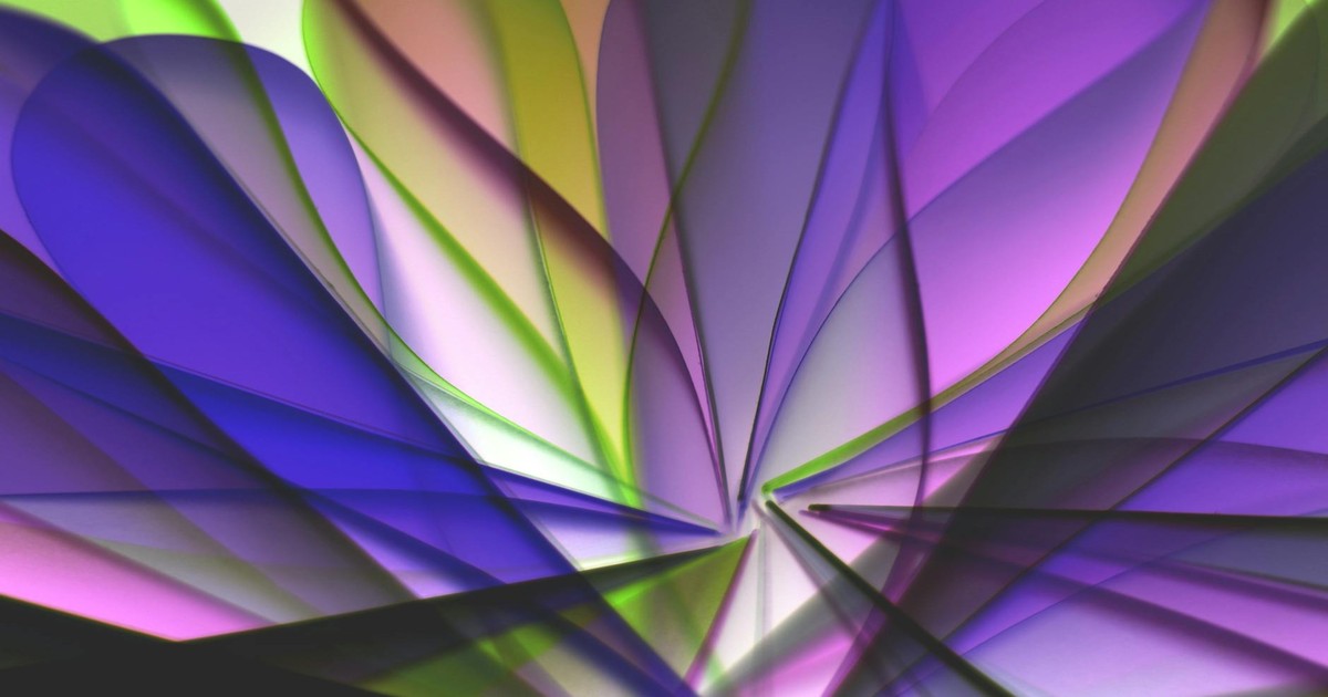
Here’s an example prompt I used last week that I’m genuinely happy with: “A cyberpunk neon city skyline with flying vehicles and holographic advertisements, vertical composition, cinematic lighting with deep purples and electric blues, reflections in wet streets, sharp focus, ultra detailed, 8k resolution, trending on ArtStation.” That generated a wallpaper I actually used because it was exactly what I was picturing.
One thing I don’t recommend: stuffing your prompts with random artist names or style modifiers just because you’ve heard they work. “In the style of Blade Runner meets Studio Ghibli meets Renaissance painting” sounds creative but often produces confused results. I’ve learned to be selective about style references and stick with two at maximum.
The negative prompts feature (what you don’t want) is criminally underused. Adding “–no blurry, text, watermarks, people” prevents common issues. I use negative prompts for every wallpaper now because they genuinely improve results. Without them, you might get text artifacts or blurry areas that ruin an otherwise perfect image.
Understanding Midjourney Parameters and Settings
Midjourney has several parameters you can add to your prompts using double dashes, and understanding these completely changes your results. The aspect ratio parameter (–ar) is crucial for wallpapers. “–ar 16:9” for standard monitors, “–ar 21:9” for ultrawide, or “–ar 9:16” for portrait phone wallpapers. I keep a note with the exact specifications for all my devices so I’m not guessing.
The quality parameter (–q) affects how detailed and refined the output is. The default is usually fine, but “–q 2” produces noticeably better results for wallpapers, though it uses more fast GPU time. I use this setting for my final versions because the extra detail is worth it. “–q 1” is faster but the quality difference is visible, so I skip it.
The stylize parameter (–s) controls how much Midjourney interprets your prompt versus following it literally. Values range from 0 to 1000, with 100 being default. I usually go with “–s 250” for wallpapers because it adds artistic interpretation while still respecting what I asked for. Too high and your prompt gets ignored; too low and it looks generic.
The chaos parameter (–c) determines variation in generations. Higher values mean more unexpected results. For wallpapers, I keep this low around “–c 20” because I want intentional designs, not chaotic randomness. That said, sometimes I’ll bump it to 50 just to see what weird direction Midjourney takes things.
The version parameter (–v 7) lets you specify which Midjourney model to use. Version 7 is current as of 2026 and produces the best results. Occasionally people use older versions for specific aesthetic effects, but honestly, V7 is superior for wallpaper work in almost every way.
These parameters stack together. A real prompt might look like: “A serene forest with fireflies, cinematic lighting, 8k –ar 16:9 –q 2 –s 250 –v 7”. This gives you specific dimensions, premium quality, a balanced artistic interpretation, and the latest model.
The Generation and Upscaling Process for Wallpaper Perfection
When you submit your prompt, you’ll get four initial generations within about 45 to 60 seconds. This is where I typically get excited and immediately stare at all four options. Sometimes one is obviously superior, but often two or three are genuinely usable, and I need to decide which direction to pursue.
Each generated image gets four buttons beneath it: U1, U2, U3, U4 (upscale specific versions) and V1, V2, V3, V4 (create variations of specific versions). The upscale buttons increase the resolution and refine the image. For wallpapers, you absolutely want to upscale your chosen design because the initial generation is only 1024×1024 pixels. Upscaled images are significantly larger and sharper.
When you click an upscale button, you get a high-resolution version that’s suitable for actual wallpaper use. The upscaling process takes about 30 to 45 seconds. This is where your wallpaper actually becomes usable because the detail and resolution are finally there. I never skip the upscale step even if the initial generation looks perfect, because the difference is dramatic once you see it full-screen.
The variation buttons are where you iterate on designs you’re close to but not quite satisfied with. Maybe you love the composition but want different colors, or you want the same mood but slightly different elements. Clicking a V button generates four new images based on that specific version. I probably use variation buttons as much as I use upscaling because rarely is the first generation your final answer.
There’s also a remix feature where you can adjust your prompt and regenerate based on one of your previous images. This is incredibly useful if you’re like “that’s 95% there but I want the colors warmer” or “can you add more detail to the foreground?” You can modify the prompt and regenerate while maintaining the core aesthetic of the image you liked.
Choosing the Right Aspect Ratios and Resolutions for Your Displays
This is something I wish I’d understood better three years ago. Not all wallpapers work for all devices, and generating in the wrong aspect ratio wastes time and GPU hours. Let me break down what actually matters.
For standard desktop monitors, you want 16:9 aspect ratio. Most people still use this, and it’s the safest bet. A 1440p wallpaper is perfect if your monitor supports it, and 1080p works fine too. I generate these as “–ar 16:9” and they upscale beautifully to fill any standard monitor.
For ultrawide monitors (which I personally use now), you need 21:9 aspect ratio. Regular 16:9 wallpapers look tiny with huge black bars on the sides, which is frustrating. I learned this the hard way by using a gorgeous 16:9 wallpaper on my ultrawide and hating it. Generate specifically with “–ar 21:9” for these monitors. The compositions can look stretched if you’re not careful, so I’m extra deliberate with my prompts for ultrawide.
For phones, portrait orientation is essential. Use “–ar 9:16” for portrait wallpapers. The composition needs to account for the top status bar and bottom navigation, so avoid putting important details at the very edges. I typically leave at least 10% margin on all sides for phone wallpapers.
For tablets or iPad wallpapers, you’re usually dealing with something between 4:3 and 16:10. I use “–ar 4:3” for most tablet work and it works well. The Midjourney upscaler handles these less common ratios fine as long as you specify them.
Once you upscale, Midjourney gives you a high-resolution image that’s typically around 2000×2000 pixels or larger depending on your aspect ratio. This is usually larger than you need. If you’re downloading for a 1440p monitor, you could downscale slightly without losing quality, though honestly, having extra resolution never hurts.
Advanced Techniques: Style Consistency and Series Creation
After three years, I’ve learned that creating a cohesive set of wallpapers is way more satisfying than random one-offs. Whether you want five wallpapers that share a common aesthetic or a series featuring variations on a theme, there are specific techniques that work.
For style consistency, I use something I call “style anchoring.” In your prompt, establish a visual language early: “In the style of minimalist digital art with geometric shapes and a cool color palette of blues and grays, clean lines, modern aesthetic.” Then for subsequent wallpapers, reference that exact phrasing. Your brain recognizes the consistency immediately, and the set feels intentional rather than random.
Create a “style template” for yourself. Mine for minimalist work looks like: “[Subject], minimalist digital art, geometric shapes, cool color palette blues and grays, clean lines, modern aesthetic, sharp focus, high contrast, 8k –ar 16:9 –q 2 –s 250 –v 7”. Then I just swap out the subject and maybe one or two other descriptors. This consistency is incredible for creating cohesive wallpaper sets.
For series creation, generate multiple images with intentional variations. You might create a “Four Seasons” series where each wallpaper shows the same landscape in different seasons. The trick is keeping enough consistency that they feel related. Specifying “part of a four-season series” in your prompt actually helps Midjourney understand what you’re going for, which surprised me the first time I tried it.
Use the variation tool systematically. Generate an image you love, then create variations focusing on different aspects: same composition with different lighting, same scene with different weather, same aesthetic with different subjects. Document what parameters produced the best results, and you’ll build a personal library of techniques that work for your taste.
I maintain a spreadsheet with successful prompts, which sounds excessive but it’s genuinely useful. Columns for subject, style, parameters, and which aspect ratios worked. This helps me recreate aesthetics I loved without spending GPU hours re-experimenting.
Downloading, Organizing, and Using Your Wallpapers
Once you’ve got your perfect upscaled image, download it directly from Midjourney. Click the three-dot menu on any upscaled image and select “Download.” The files are high-quality PNGs with transparency preserved if relevant, though most wallpapers are fully opaque.
Organize these somewhere sensible. I have a folder structure like “Wallpapers/2026/January/Minimalist” and “Wallpapers/2026/January/Nature” so I can quickly find themes I want to revisit. It’s easier than you’d think to end up with 500 wallpapers scattered randomly if you don’t organize from the start.
For desktop use, most operating systems have straightforward wallpaper setting options. Right-click on an image and select “Set as wallpaper” on Windows, or drag it into System Preferences on Mac. I rotate my wallpaper every week or so, which keeps things fresh without being annoying.
For phones, the process varies slightly depending on iOS or Android, but basically you’ll set it as your lock screen wallpaper or home screen wallpaper in settings. The “–ar 9:16” aspect ratio I mentioned earlier specifically accounts for this use case.
One thing I do that’s become routine: I keep a “current favorites” folder with maybe 5 to 10 wallpapers I genuinely love and rotate through those. Then I have an “archive” folder for everything else. This prevents decision paralysis and means I’m actually looking at wallpapers I’ve chosen deliberately rather than getting stuck with one for months.
Common Mistakes to Avoid
Overstuffing your prompt with too many ideas is probably the biggest mistake I see people make, and I definitely did this initially. “A cyberpunk neon city with flying cars and holographic billboards and a giant robot and rain and people on flying motorcycles” produces chaotic garbage where everything competes for attention. Keep your core concept singular and layer in details that support it rather than clutter it.
Ignoring aspect ratio specifications wastes GPU hours. I used to generate at default settings and then crop images to fit my ultrawide monitor, losing quality and composition. Specifying your exact aspect ratio upfront saves time and produces better results because Midjourney composes intentionally for that shape.
Not using negative prompts is leaving quality on the table. Text artifacts, watermarks, blurry areas, and weird hands appear frequently without negative prompts. I stopped seeing these issues once I started using “–no blurry, text, watermark, distorted, artifact” on every single generation.
Relying too heavily on artist style references doesn’t work as well as you’d think. “In the style of Studio Ghibli meets Blade Runner meets Van Gogh” sounds impressive but produces confused results. Two style references maximum, and they should be complementary rather than contradictory. I learned this through painful experimentation.
Forgetting to upscale before downloading is something I still occasionally do when I’m excited about a result. The initial 1024×1024 version looks okay on screen but is too small for actual wallpaper use. Always upscale before you consider a design final. It takes 30 seconds and the quality difference is significant.
One thing I genuinely dislike: the lack of fine control over composition. Sometimes Midjourney puts your main subject off-center in ways that don’t work for wallpapers. You can request “centered composition” in your prompt, which helps, but there’s still randomness. This is a limitation worth acknowledging because sometimes you need to regenerate multiple times to get composition you’re actually happy with.
Optimizing Your GPU Hours and Budget
Fast GPU time is your most valuable resource, and managing it properly is the difference between creating freely and constantly stressing about running out. I use about 200 to 300 fast GPU hours per month creating wallpapers and other designs, which is why I’m on the Pro plan.
Calculate realistically how many images you’ll generate. If you’re creating one wallpaper per week, you probably need the Standard plan. If you’re like me and generating multiple variations and series, Pro is essential. Each generation uses roughly 0.5 to 1 minute of GPU time depending on complexity, and you have 30 hours monthly on Pro, which sounds like plenty until you start experimenting.
Use relax mode for experimentation. Midjourney offers a “Relax” GPU queue option that’s free but much slower, around 5 to 10 minutes per generation. I use this for testing prompt ideas that I’m not sure about. If the result looks promising, I’ll regenerate on fast GPU for a refined version. This trick probably saves me 30% of my monthly GPU budget.
Batch your generations strategically. Instead of generating one wallpaper at a time, I’ll queue up 5 to 10 prompts in succession and let them process. This feels more efficient psychologically and you can review them all at once instead of trickling through results over a full day.
Don’t regenerate endlessly trying for perfection. At some point, you need to accept “this is 95% of what I wanted” and move on. I spent way too much GPU time early on trying to get images pixel-perfect. A good wallpaper beats a perfect concept that doesn’t exist yet.
Staying Current with Midjourney Updates and New Features
Midjourney releases significant updates regularly, and staying aware of them actually matters for wallpaper creation. The 2026 version is noticeably better than 2025, particularly in consistency and composition understanding. I check their website monthly for new features or parameter options I might have missed.
Follow their official announcements on their website or their community discord. I know I said the web interface is the main way to use Midjourney now, but their community discord still gets announcements first. You’ll hear about new models, parameters, or capabilities before they show up in documentation.
Experiment with new features intentionally. When V7 rolled out, I spent one evening just testing it against V6 for wallpapers. The improvement in composition and color coherence was obvious. Testing new versions against your standard prompts tells you immediately whether they’re worth using.
Be aware that earlier versions sometimes have different qualities useful for specific aesthetics. V6 had a certain painterly quality that I occasionally miss, but V7’s overall capability is superior for wallpapers. You can specify versions in your prompt if you want to test older models, though I rarely bother anymore.
Final Thoughts
Creating AI wallpapers with Midjourney is genuinely enjoyable in a way that surprises me three years into doing it. There’s something satisfying about translating a vague mood or aesthetic into a specific prompt and then watching Midjourney interpret that into an image that’s actually better than what you imagined. The barrier to entry is lower than ever with the streamlined web interface, and the quality improvements mean you’re not fighting the tool constantly like you used to.
That said, I want to be honest: it’s not magic, and it’s not a replacement for artistic understanding. You need to think about composition, color, mood, and intention. The tool handles execution, but you handle vision. The people creating genuinely great AI wallpapers are the ones who understand design principles, not just prompt engineering. This is good news because it means your taste and intention actually matter, which is more satisfying than if it were purely mechanical.
My personal recommendation: start with the Standard plan, spend a week creating wallpapers you’d actually use, and see if you want to upgrade to Pro. If you’re generating one wallpaper per week just to have something fresh on your desktop, Standard is plenty. If you’re creating series, experimenting with styles, or just enjoying the process, Pro gives you the breathing room to be creative without constantly watching your GPU hours.
The 2026 version of Midjourney for wallpapers is genuinely worth your time if you like having personalized, beautiful desktop environments. I have friends who still use generic stock photos, and whenever they see my current wallpaper, they ask how I made it. That’s the best part: you get to say “I created this” and actually mean it.
Frequently Asked Questions
Do I need any design experience to create good wallpapers with Midjourney?
Not necessarily, but understanding basic design principles helps tremendously. You don’t need to be able to draw or use Photoshop, but knowing what you like visually and being able to describe it clearly makes a huge difference. I’d recommend spending a few hours just looking at wallpapers you love and thinking about why they work: composition, color palette, mood, focus. Then try recreating those feelings in your prompts. The tool handles the execution, but your eye for what looks good is essential.
Can I sell wallpapers I create with Midjourney?
The Midjourney terms of service depend on your subscription plan. If you’re on a paid plan, you generally own the rights to images you generate and can sell them, though you should check the current terms on their website as these occasionally change. That said, just because you technically can sell them doesn’t mean you should without thinking about it. If you’re thinking about building a wallpaper business, invest time in understanding copyright and licensing to avoid problems.
What should I do if I generate an image that’s close but not quite right?
Use the variation button to generate new versions based on the image you liked. If it’s a specific element you want to change, you can use the remix feature to adjust your prompt while maintaining the overall aesthetic. Alternatively, take note of what worked (the color palette, composition, mood) and create a new prompt from scratch that incorporates those elements with the adjustments you want. Sometimes starting fresh is faster than iterating endlessly on something that’s almost there.
How do I know if I should upgrade from Standard to Pro plan?
Track your fast GPU usage for a month on the Standard plan. If you’re regularly running out and having to wait in the relax queue, upgrade. If you’re only using 60% to 70% of your monthly allotment, Standard is probably fine. Pro costs twice as much but gives twice the fast GPU hours, so it’s worth it if you’re actually using the hours. I was skeptical about upgrading initially, but I genuinely use all 30 hours per month, so it’s a good investment for me.